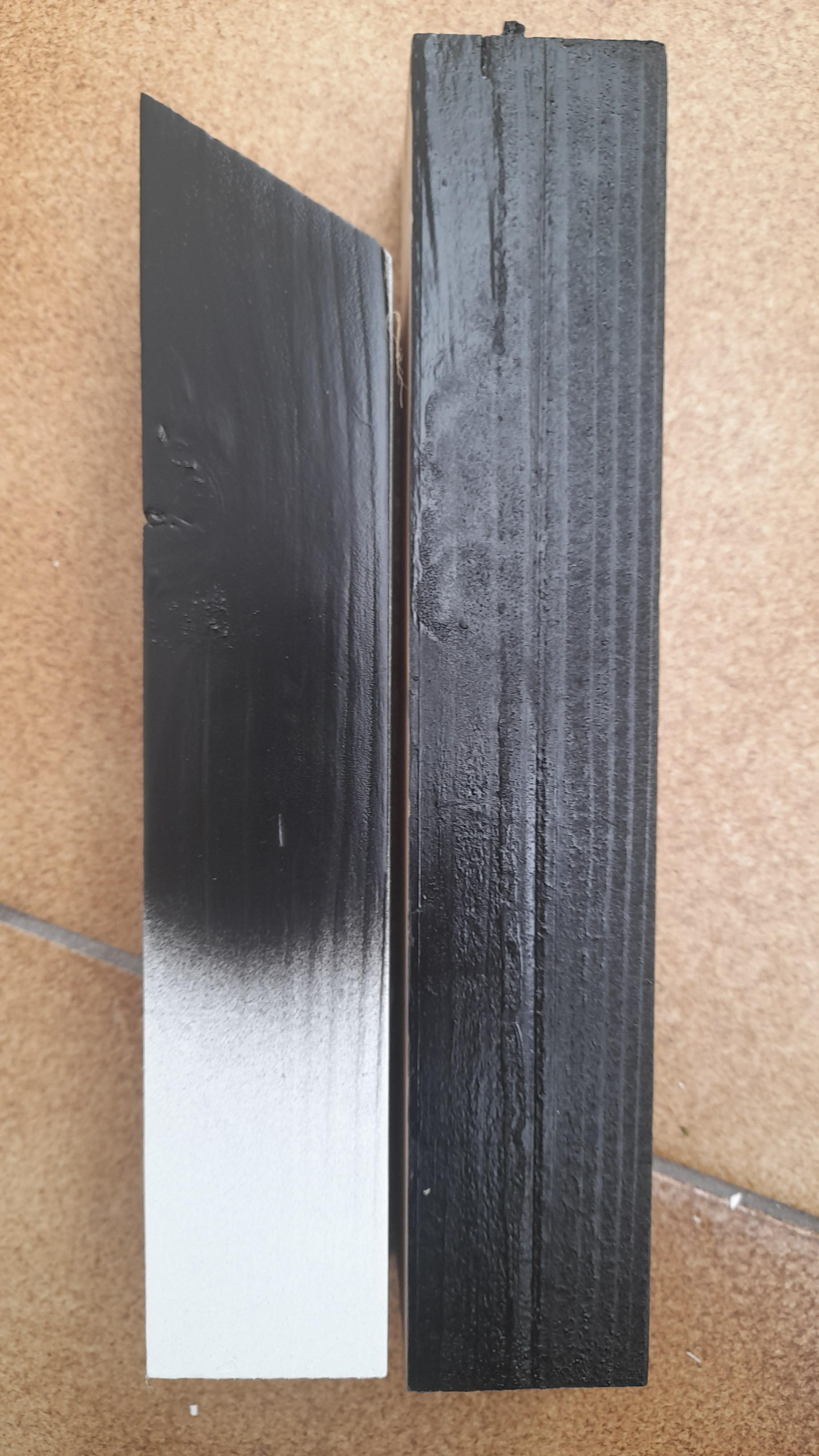
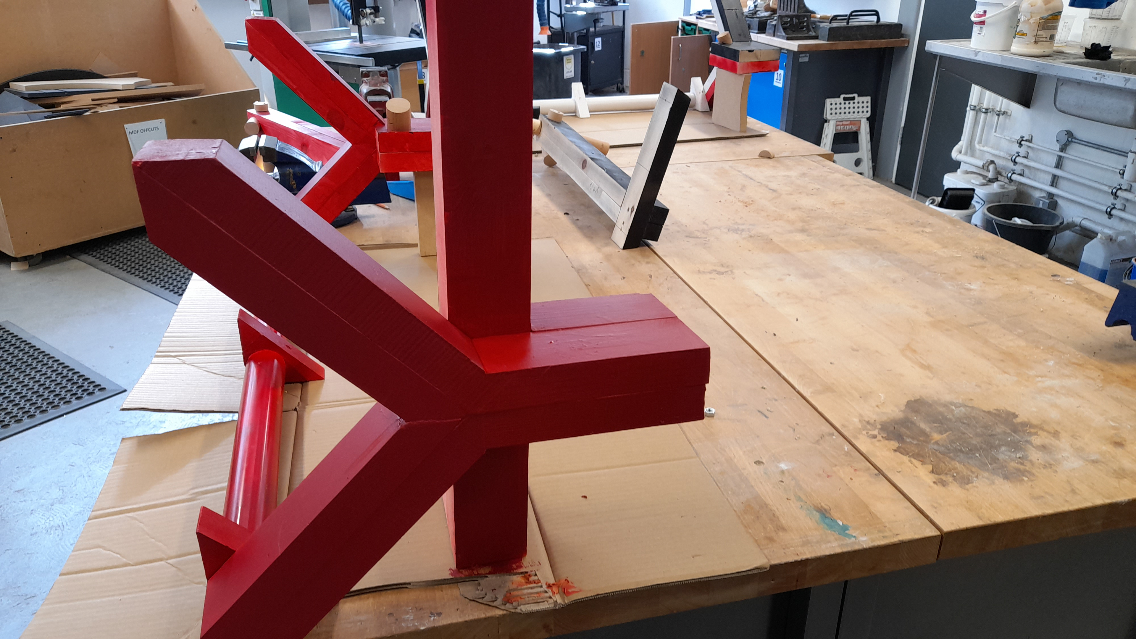
The above left shows a trial run to see how the surface of the timber would look with or without primer. There is a difference but that being said, it wouldn't be a massive issue if all of it wasn't primed since most of the timber is not visible anyway. I've also sealed the timber beforehand to prevent it from cracking over time.
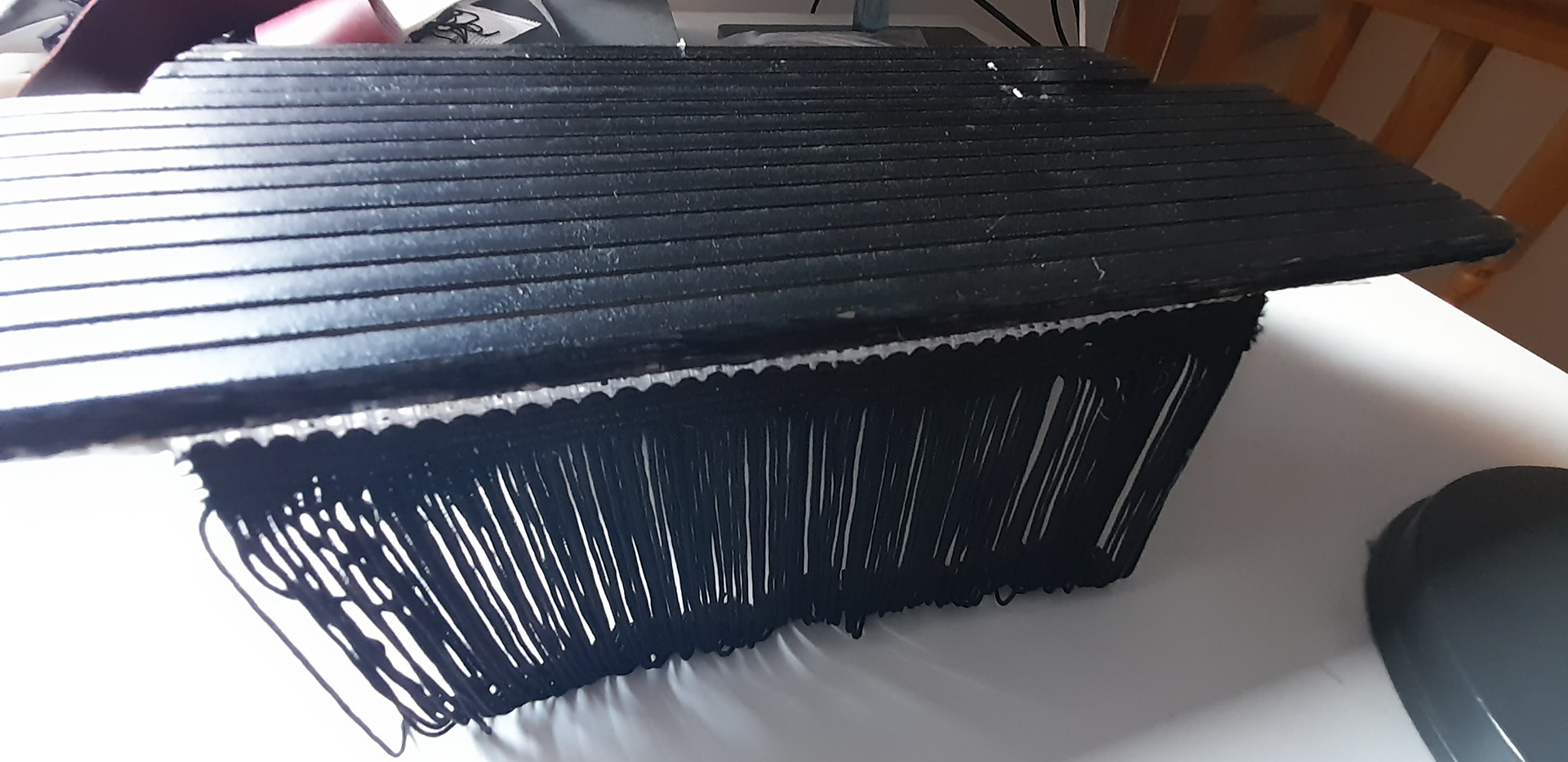
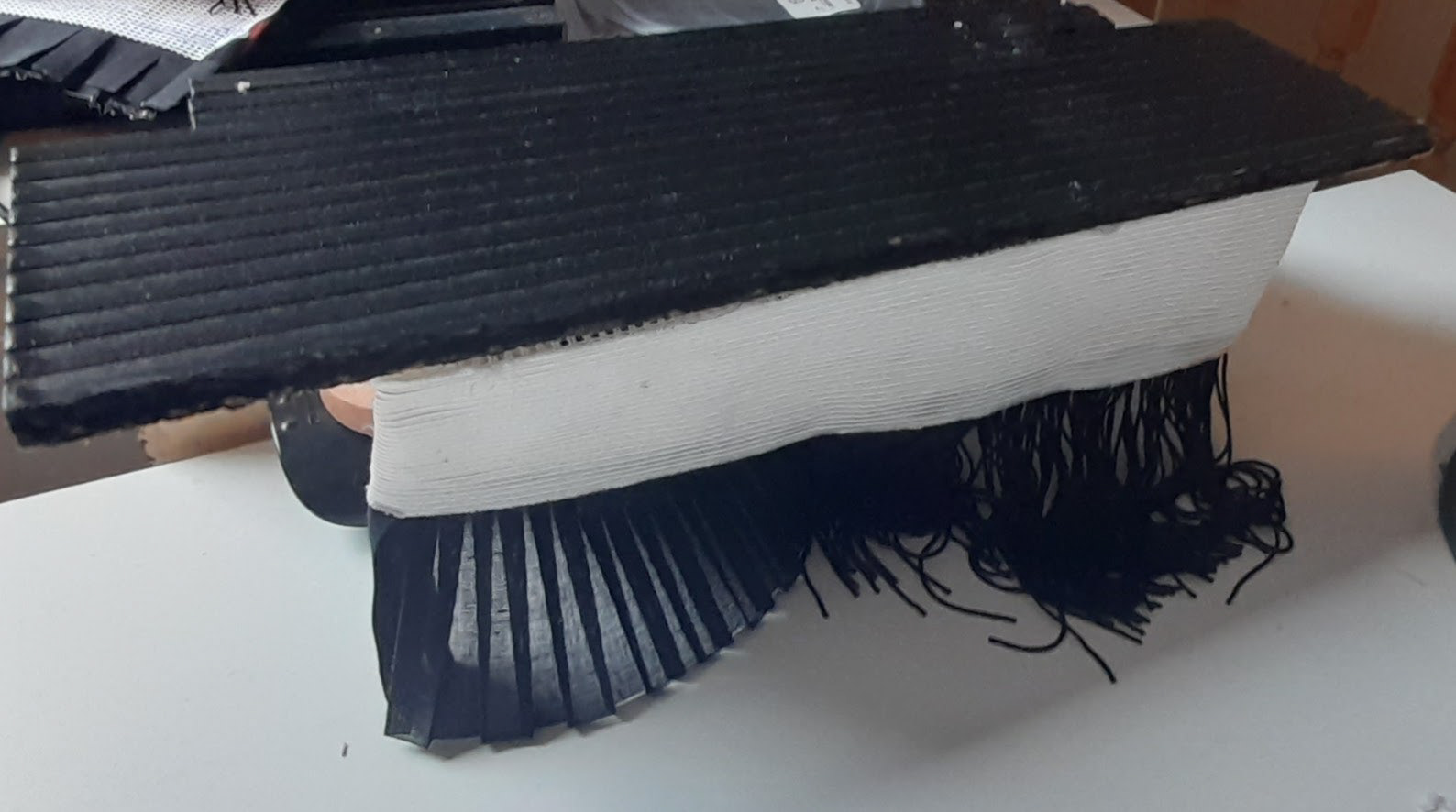
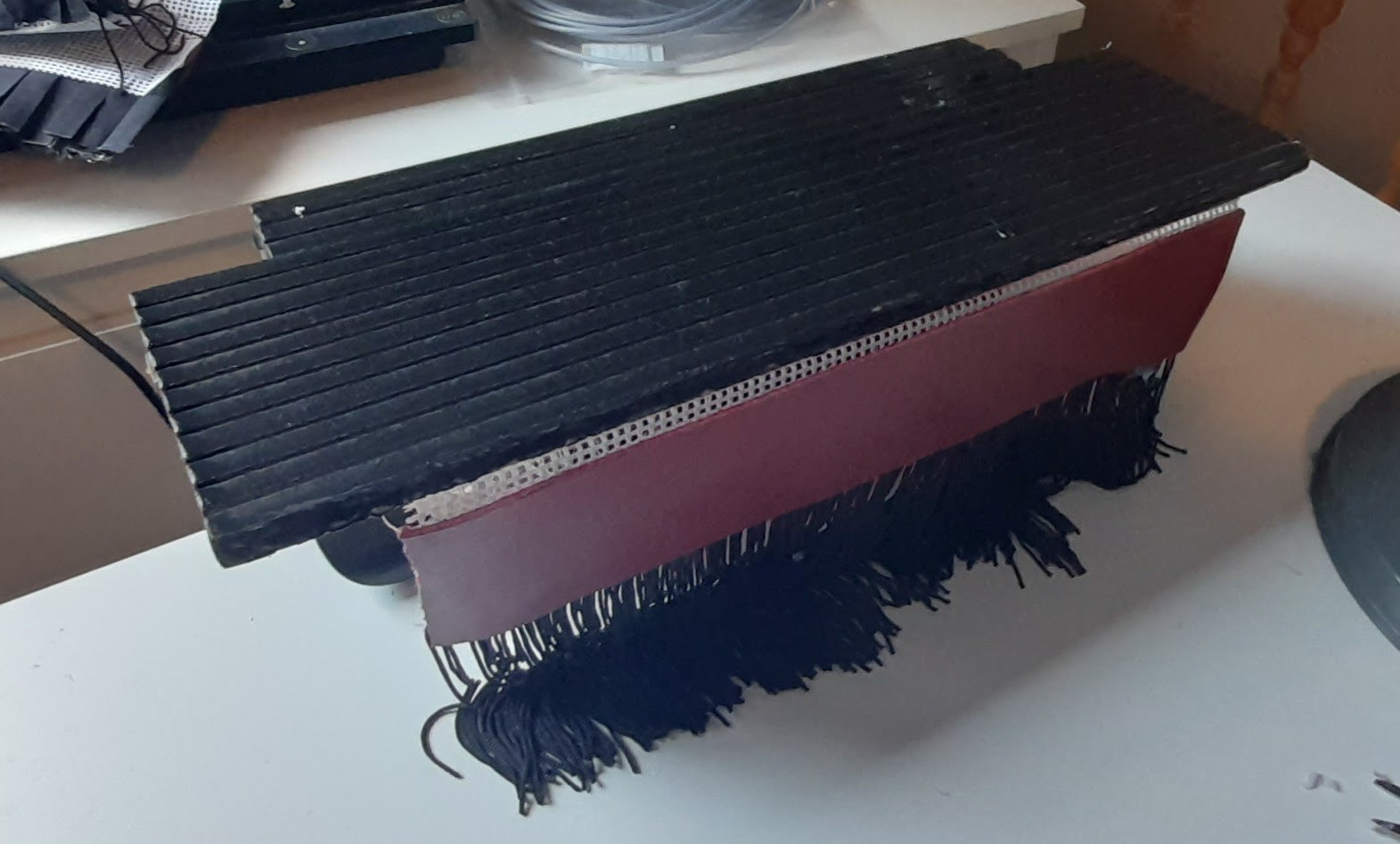
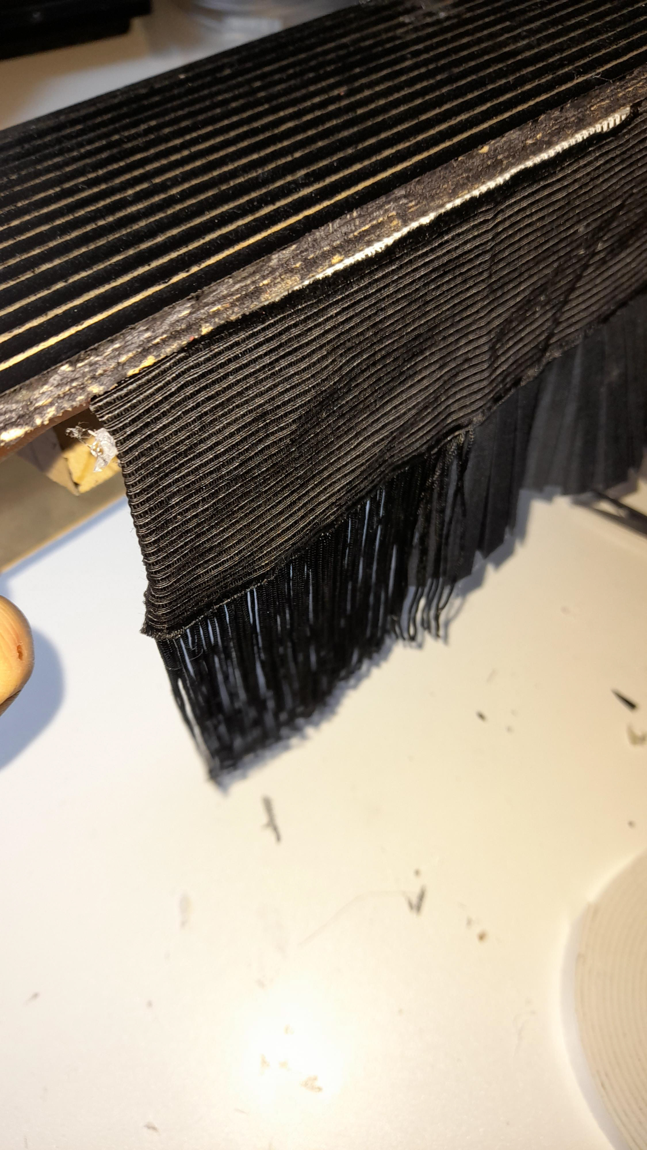

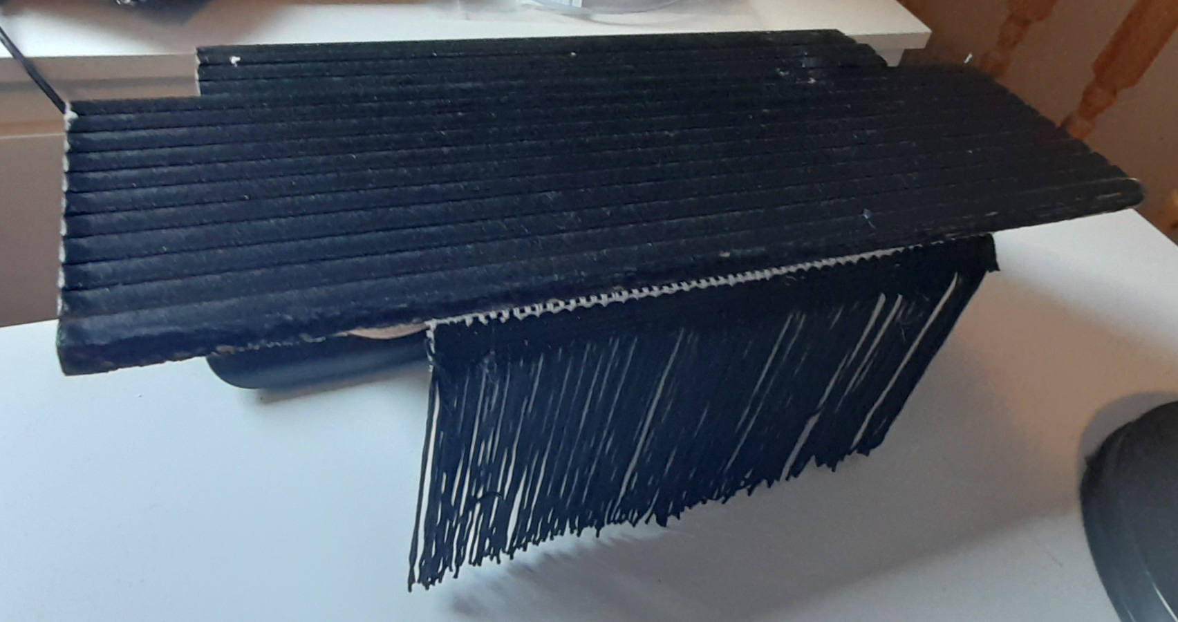

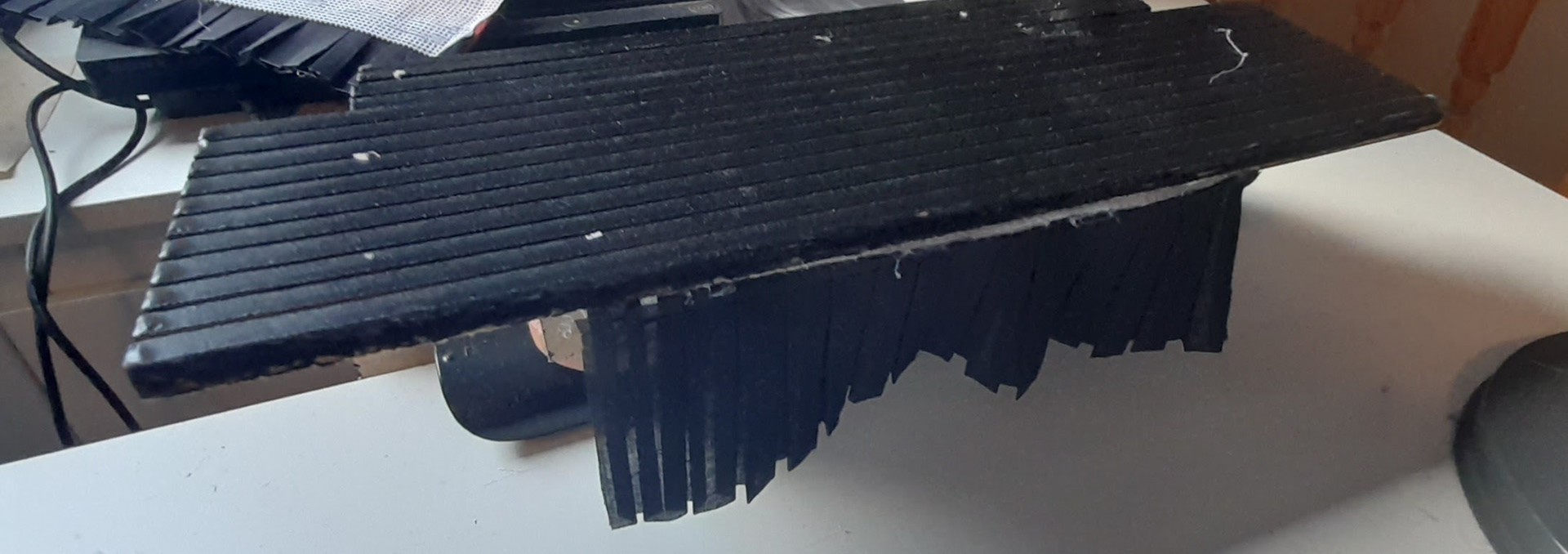
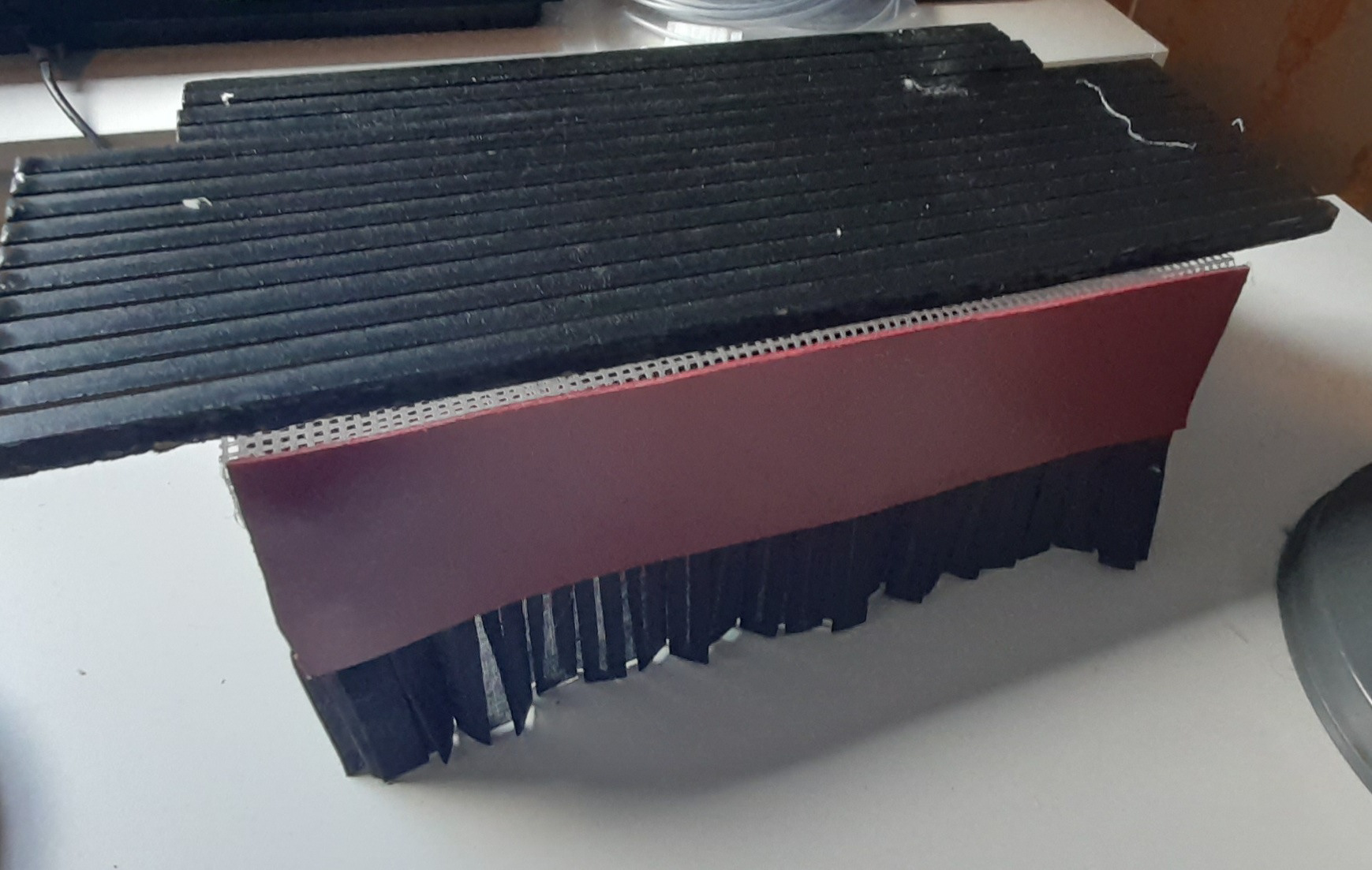
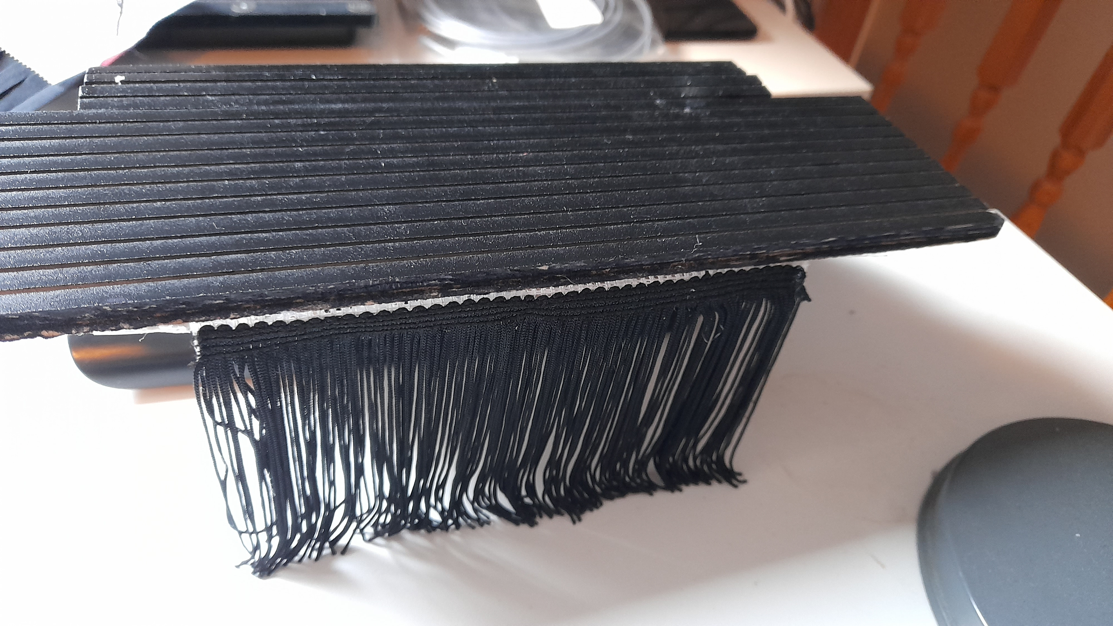
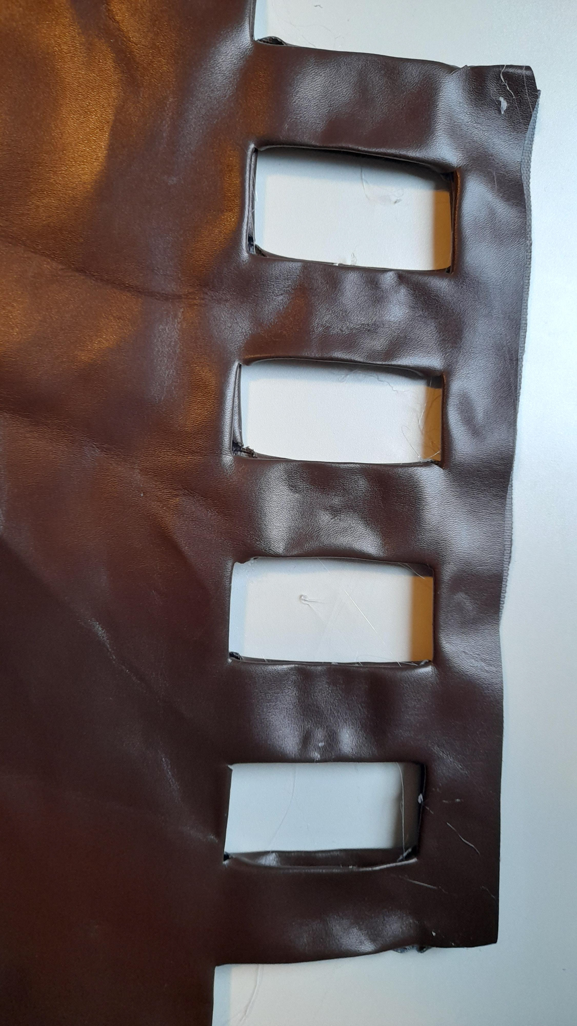
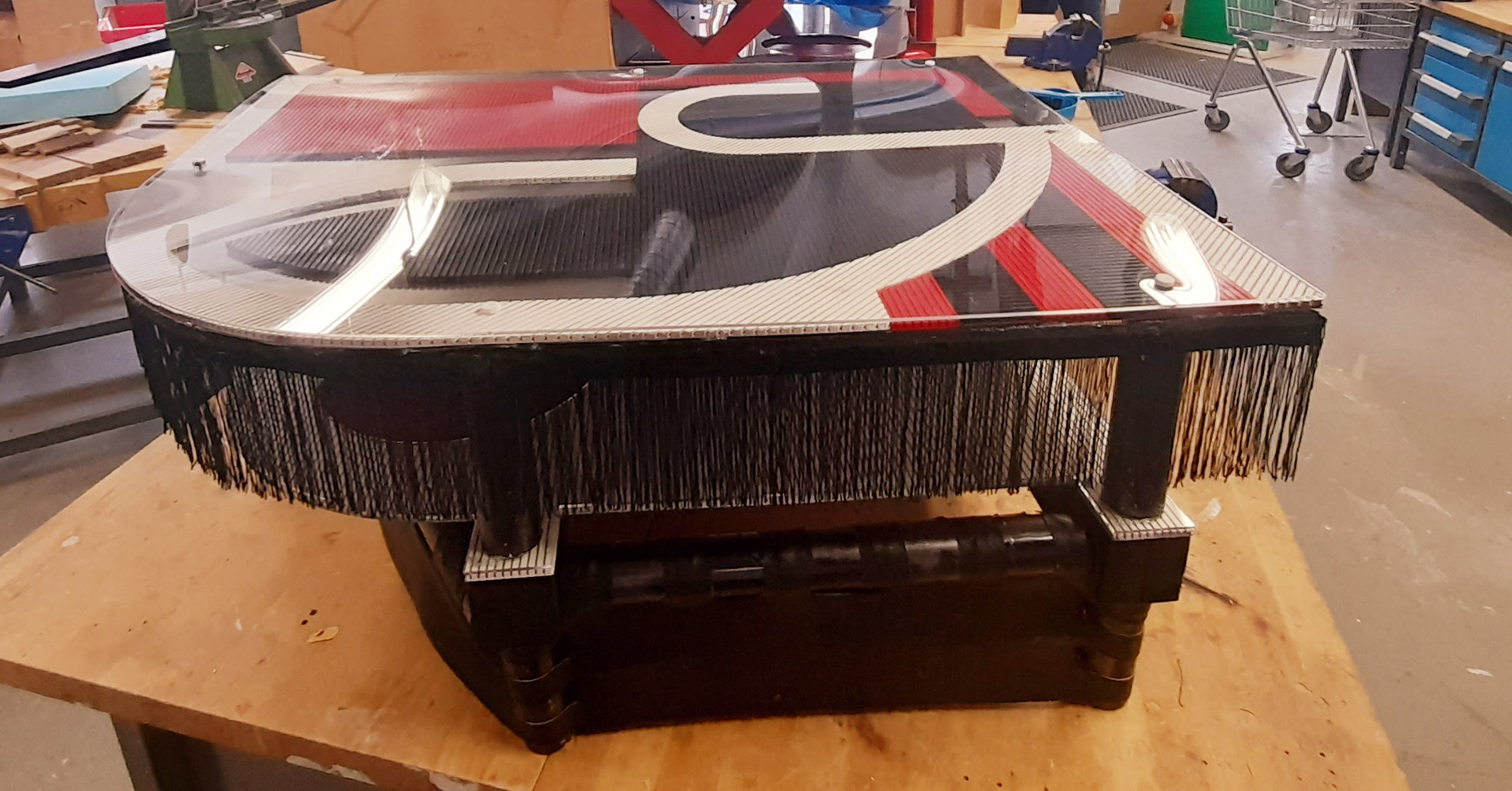
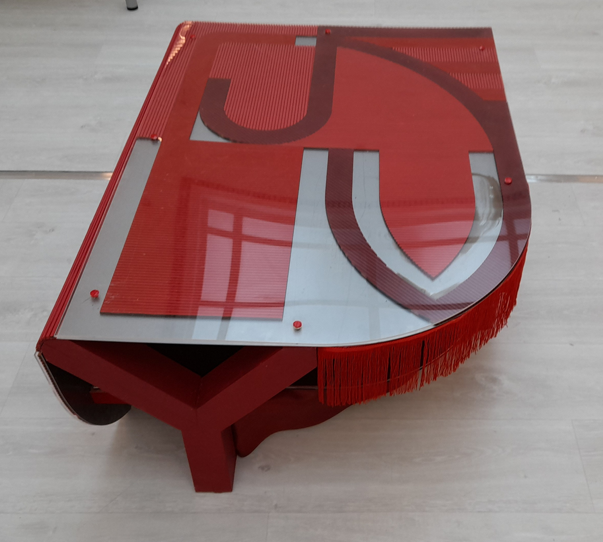
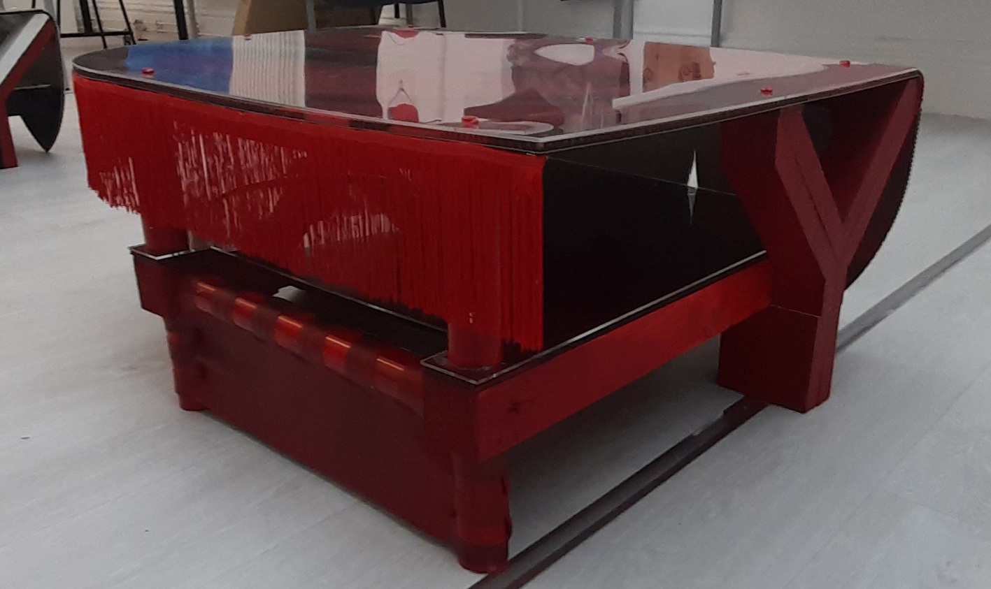
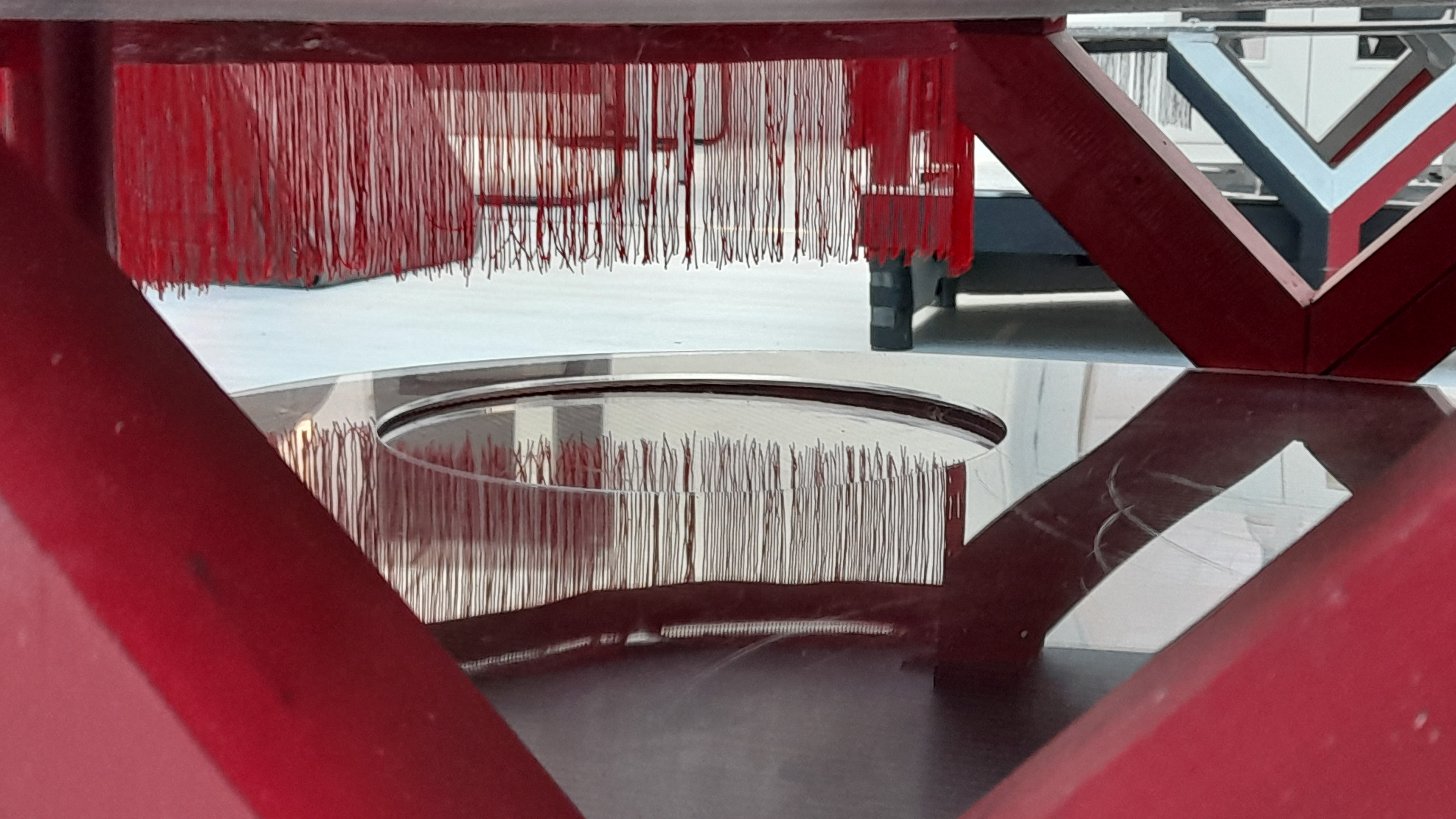
In the renders of the previous page/link, there was an attempt to show a trim/fringe. This represents the vexillum term due to these flags having a similar feature. Instead of choosing a random material, I wouldn't try a bunch out which is shown in the above images. The image below is the idea I settled on. Instead of having a mixture of colours or materials, it would look better by keeping singular. the white plastic positioned behind it is a double tapestry canvas. It's weaved plastic like material which is firm. this helped keep it in place.
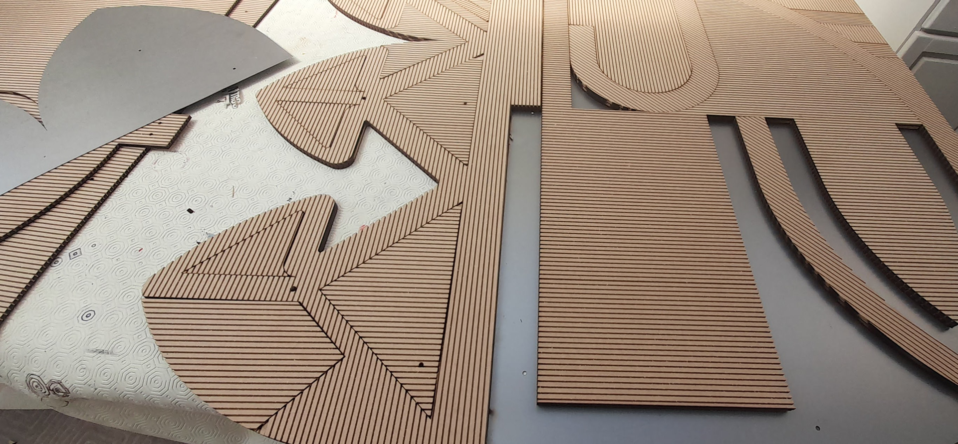
When the material arrived after being cut to size all seemed fine. However, some of the holes were cut too large. The laser went over them twice for some reason making them slightly too large. this was mainly on the curved triangle parts. what I also related was that the holes were not in the position I had requested. Therefore the oversized holes need to be filled in with shortened dowel and glue, once they have been set I'm going to drill the holes in the right location. Or the other option is wood fill and I just scrape the bits in the grooves out.

The wood filler was the right choice. The pray paint used was acrylic and the visual effect is eye-catching. Below was my attempt at doing the fabric trial run a 2nd time. It looks worst than the previous one. I've realized that I'm overthinking it since the tables are low and the part that needs fabric is even lower. Hence I'll do something similar to the first run.

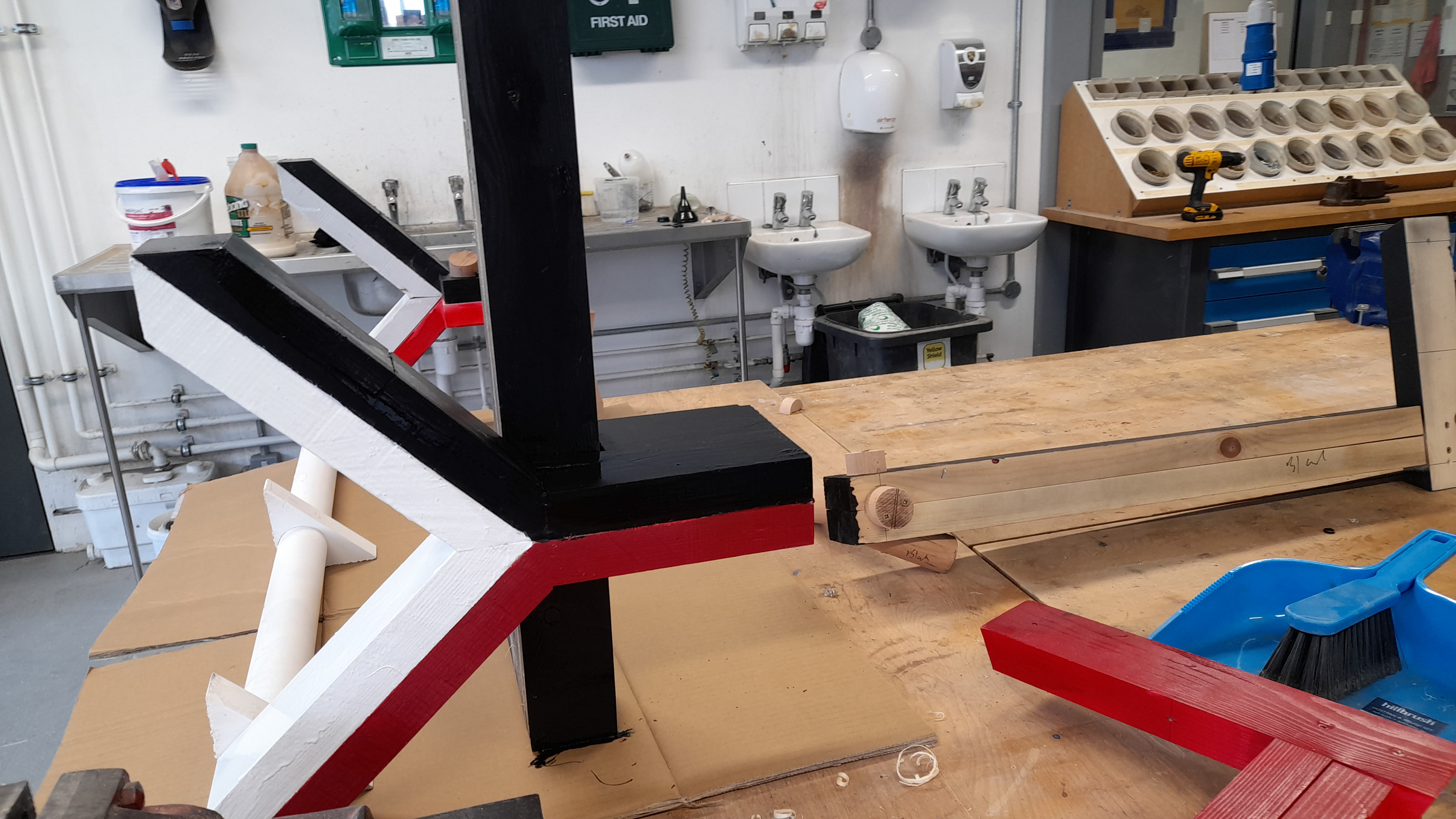

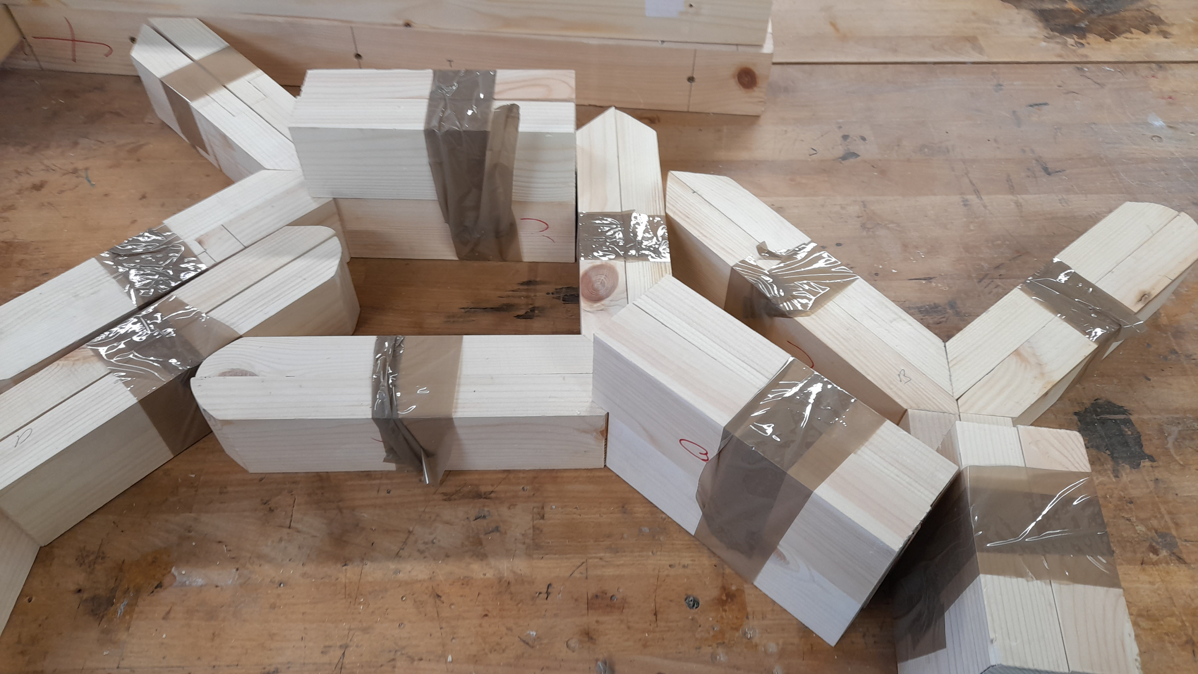
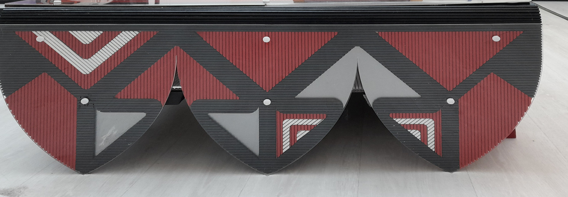
I would like to make it known that when I had sent the flexible MDF off to be laser I had provided notes staking that the stripped/ridge side should face upwards facing the laser. The reason being if it weren't then I would need to take the already made frame apart. This is because the design is not symmetrical. When the parts did arrive they were laser cut the wrong way apart from one board. I had sent 3 boards but the operator and customer service were under the assumption that the note provided was for one board only. So instead of completely scrapping the frame I just took it apart and cut and swapped certain parts. Therefore the overall appearance of the coffee tables is not as professional as I wanted since everything that was meant to line up smoothly was not possible. Below shows how the design layout changed in the final model due to what is described above.
I'll admit I was panicking because the design was not how I wanted it to be but as you can see in the photo below I was making the tables on a worktop, This meant that I wasn't getting a proper look at how they would be if they were lower, which they are meant to be. Therefore I realised that I was overthinking it since not every feature will be noticeable to the eye. By which I mean you are going to be looking down on it and not at eye level.

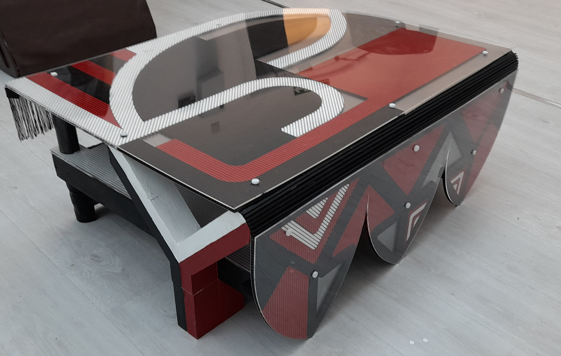

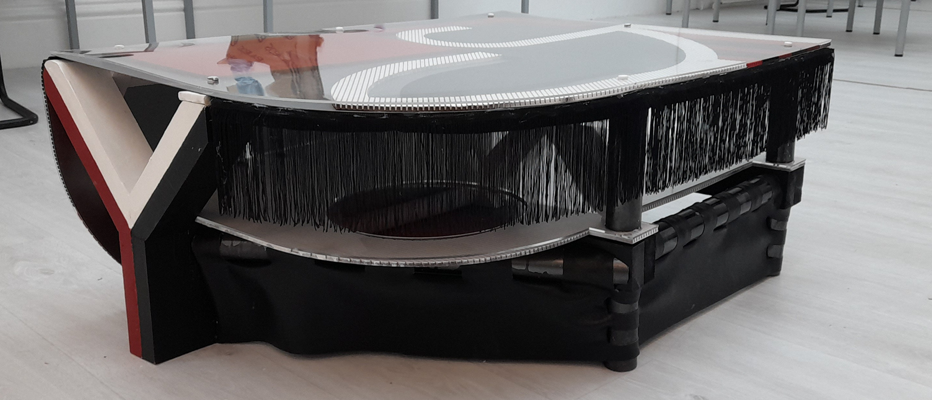


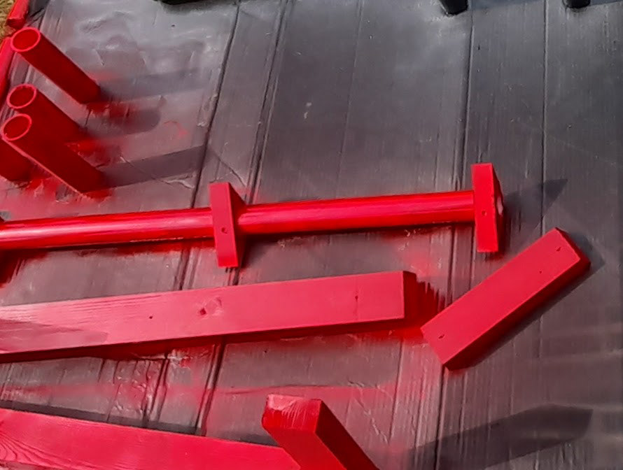
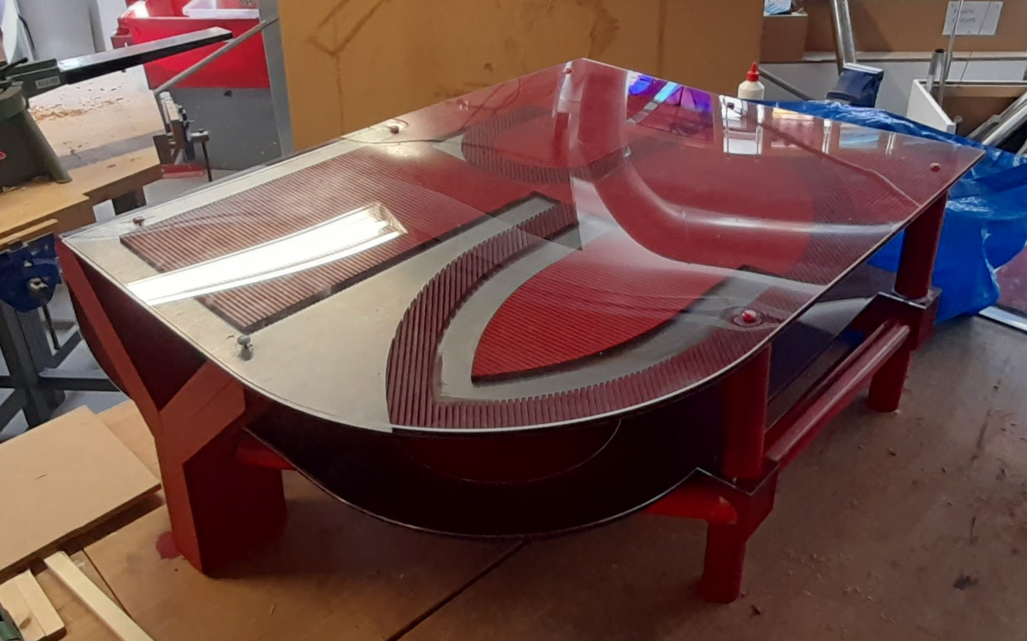
In the below photos you can notice that the back acrylic on the complete red had split. This happened by pure accident. At this moment of typing, I'm still waiting to find out if I can replace it in time before handing it in for marking. If not it's not the end of the world.
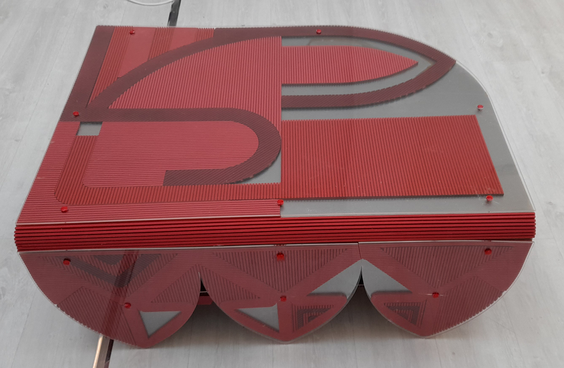


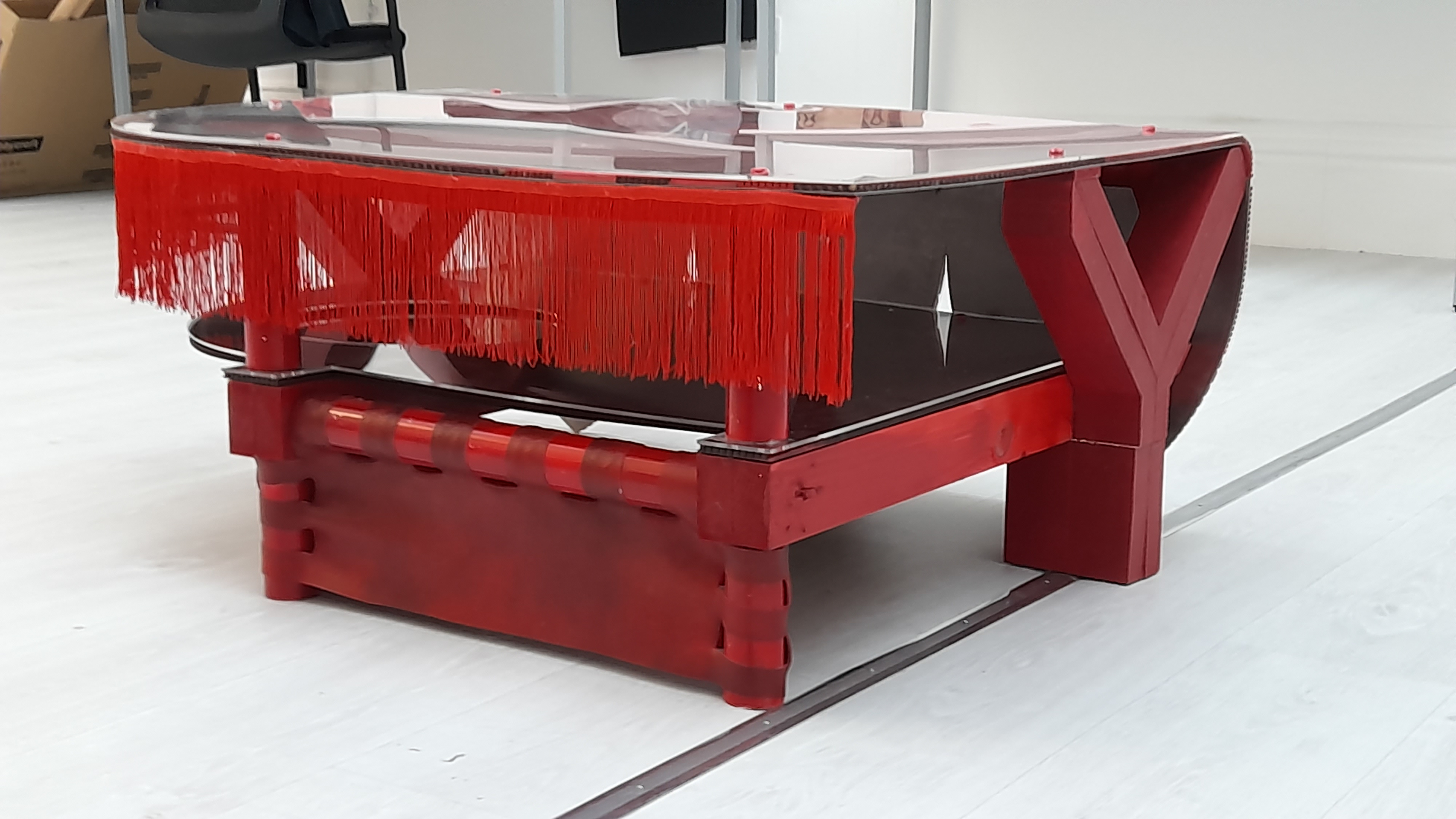
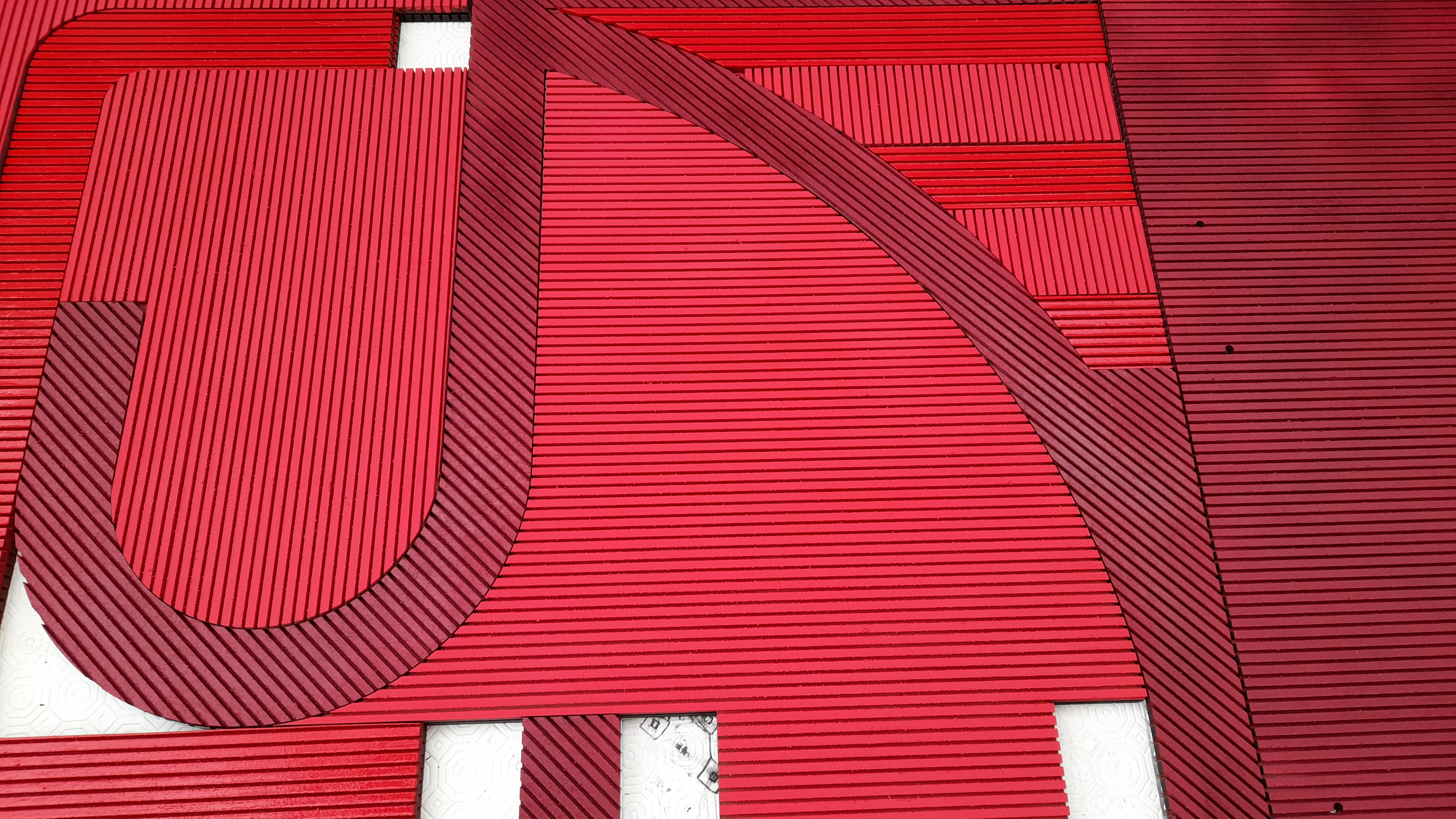
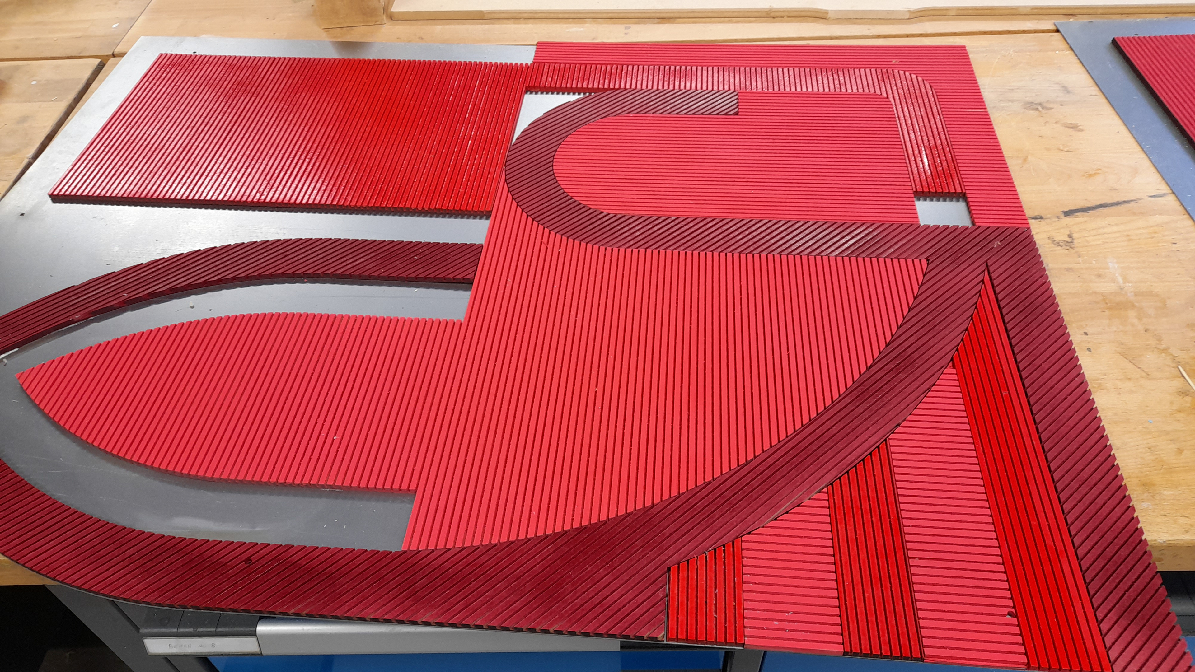
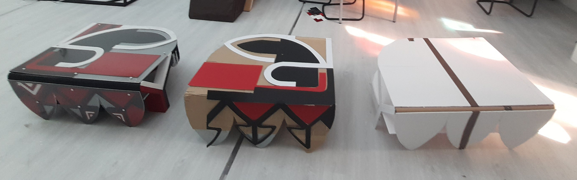
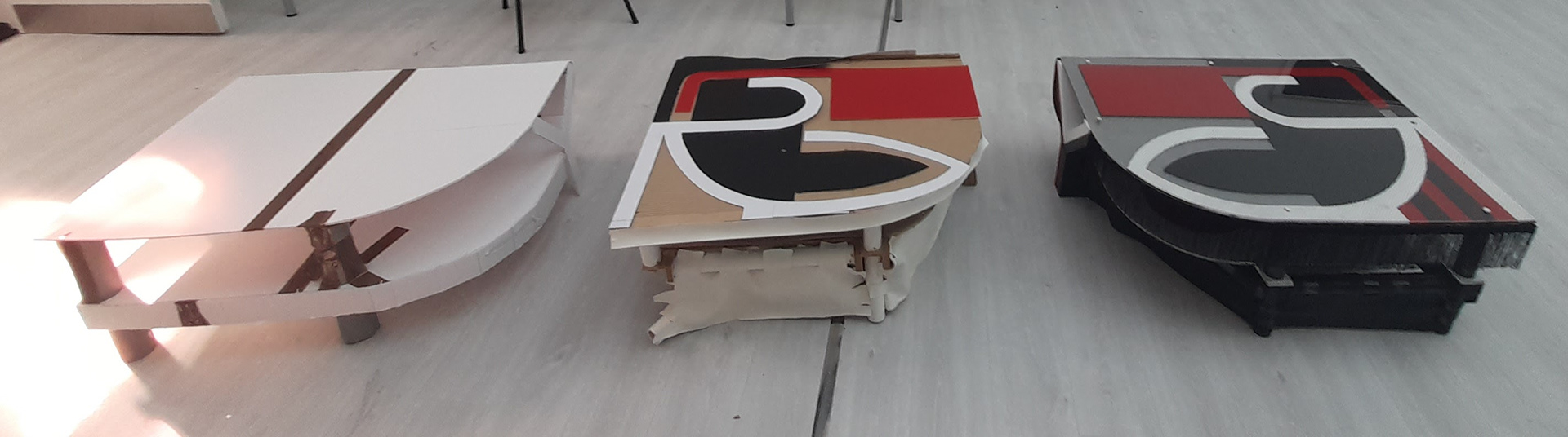
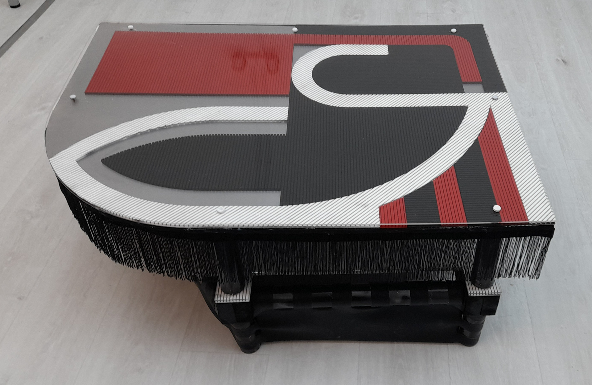
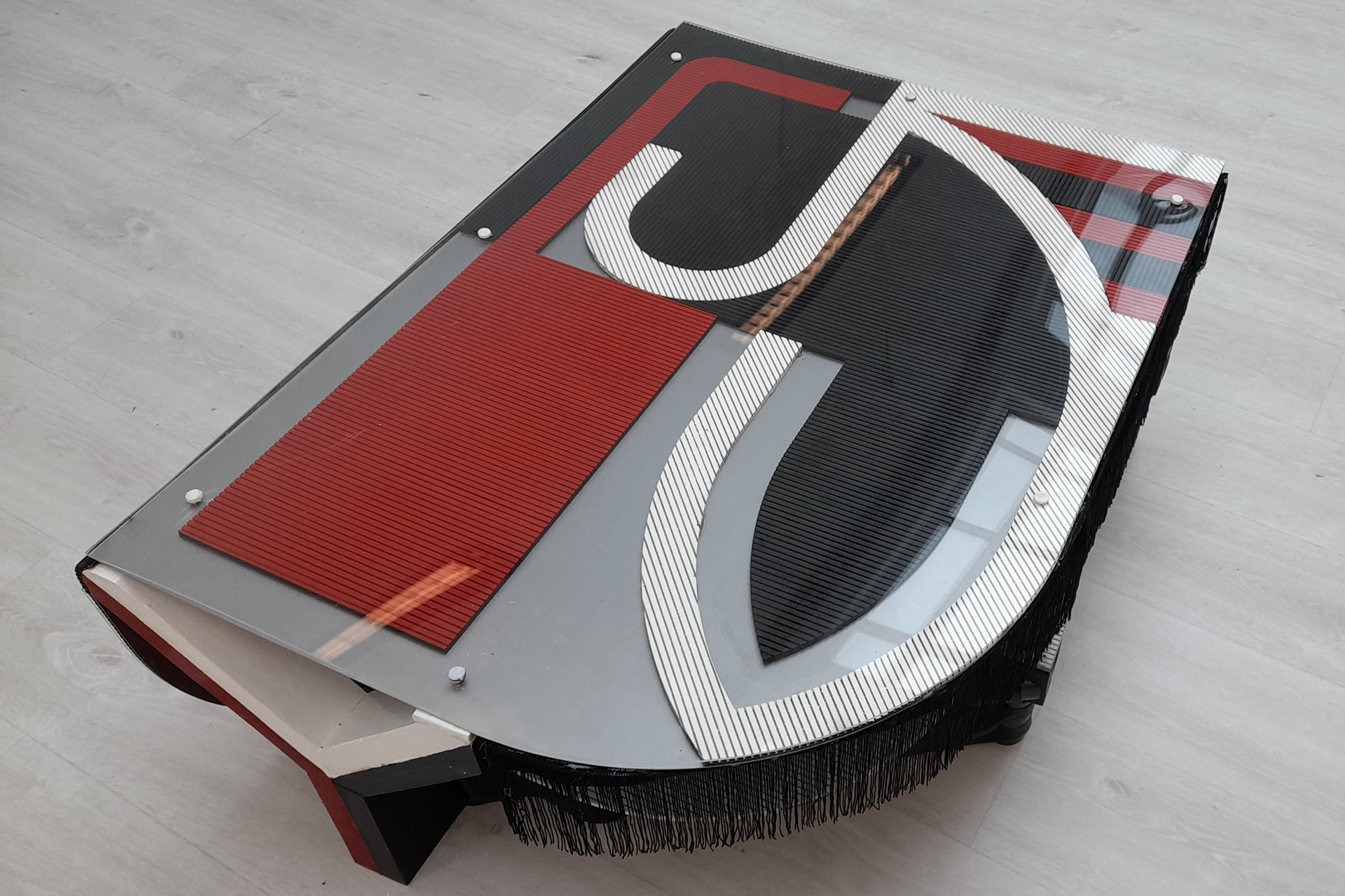
Two colour concepts were chosen from six. The single red, well shades of red, was a bold choice because I wanted it to stand out and also to draw someone's attention. Having various shades makes it a contrasting view.
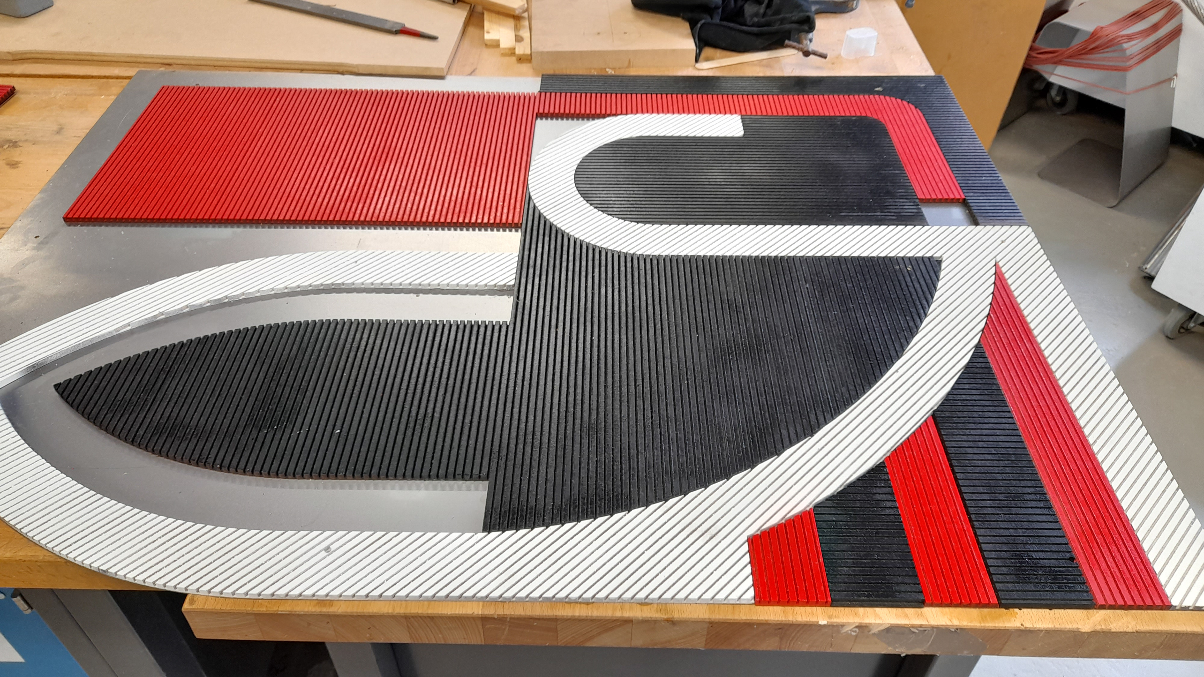
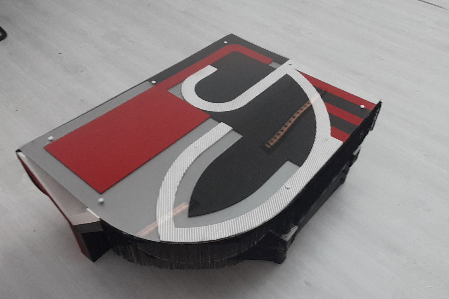
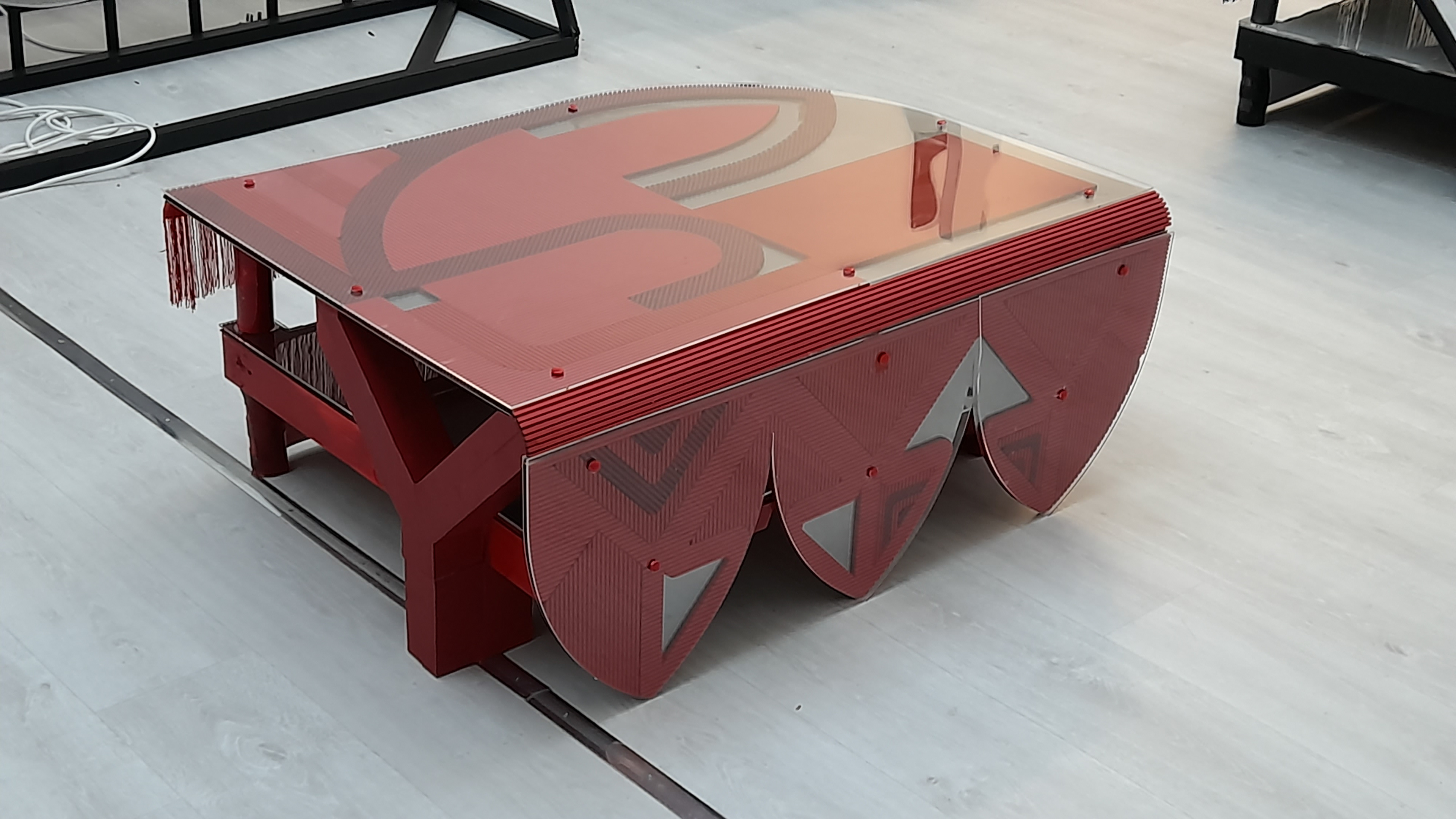
The 3 colour scheme model has a more dramatic flare. The white and red help balance out the dominating black preventing it from looking too gothic. one of the words within the section was dazzle camouflage. How I used this term to influence the design changed frequently as evident in what you have seen on this portfolio. The key aspect of dazzle camouflage I to have stripes/lines going in different directions. I incorporated this by having the MDF cut at different angles so that the lines in each part were either going at an angle, horizontal or vertical.
The name of the design is called escutcheon coffee tables. I choose this because the terms dexter and sinister describe areas on a shield within heraldry/coat of arms design. Which comes under tincture. But furthermore, the coat of arms that is made from tincture rules creates the focal point of the bearer. The focal point is the shield. If a shied was to display a coat of arms then it would be called an escutcheon. since it is no longer an ordinary shield. Since these shields would vary in colour schemes and design, I thought escutcheon would be a suitable choice due to how I came up with six different variations.